Put yourself in a prospective donor’s shoes, and take a close look at your donation website.
Can you easily find the resources you need? Does it compel you to give?
If not, it may be time to rethink your website. After all, your donation website’s usability and overall experience could mean the difference between acquiring a gift and losing a contribution.
A donation website won’t capture the attention it needs if you don’t put the care and time into it that your donors deserve. Once it’s caught users’ eyes, you’ll need to compel them to give, because visits mean nothing if your conversion rates are low.
If your nonprofit is new to the digital world, don’t worry too much! High conversion rates are a straightforward concept to understand (but difficult to master). In this case, a conversion rate is simply the number of visits your donation website receives versus the number of actual donations made through it. Think of it this way: you want to convert your visitors into secured donors.
Thinking of the donation process in these terms helps you to stay focused on the small adjustments needed to make huge differences in your revenue.
To boost donation website conversion rates, follow these effective steps:
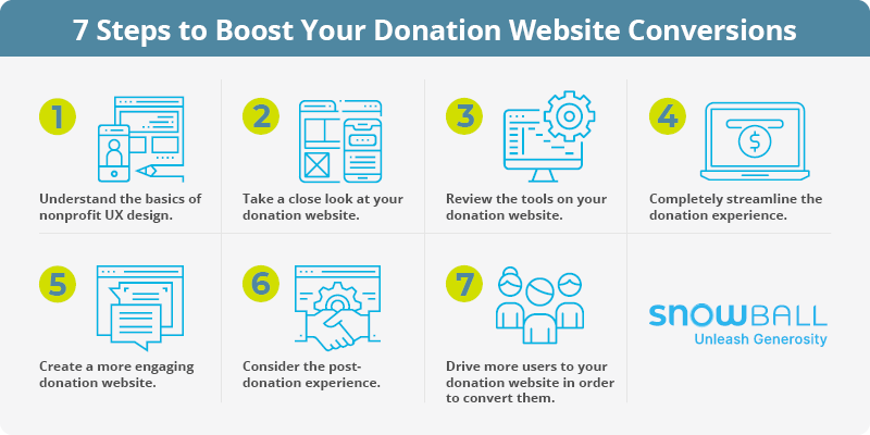
- Understand the basics of nonprofit UX design.
- Take a close look at your donation website.
- Review the tools on your donation website.
- Completely streamline the donation experience.
- Create a more engaging donation website.
- Consider the post-donation experience.
- Drive more users to your donation website in order to convert them.
Remember, as your organization grows, you can’t do it alone. Prioritize your donors with your donation website. Ready to decrease bounce rates and increase conversions? Let’s get started!
Step 1: Understand the basics of nonprofit UX design.
User experience (UX) should be your main priority. Put yourself in your prospective donors’ shoes, and think about how they see your website. Is it easy to complete a donation? Does the content on your website flow and include relevant information? Does it get to the point, or is there too much to read? These are the kinds of questions you should keep in mind when creating your donation website, or any website for that matter.
It’s safe to assume that visitors at this stage are here for one main reason: to financially support your nonprofit. However, they won’t stick around forever if you’re bombarding them with demanding, long-winded tasks.
For the best results, optimize your UX design. Consider the following optimization tips to do this effectively:
- Use buttons. Buttons are a great visual component for donation pages. Capture users’ attention with colorful calls-to-action, suggested giving amount buttons, and so on.
- Simplify the process. Make sure your donation form is clean and simple. Limit it to one page with as few fields as possible to streamline the giving process. Ensure that you still capture the important information, though.
- Eliminate unnecessary information. Don’t distract your prospects. Only include straightforward, related text and photos.
- Include multiple giving options. From multiple payment methods to recurring donation options, make sure donors can give the way they want to.
Accessibility
With a growing dependence on mobile technology, mobile-optimized donation websites are more important than ever. In fact, half of all website traffic comes from mobile and tablet users. To account for this, make sure your organization’s donation website is optimized for mobile users in every possible way. For instance, make sure to:
- Avoid pop-ups.
- Reduce the amount of text.
- Limit the graphics.
- Keep input fields to a minimum.
After optimizing your donation website, you must actively facilitate website engagement for users. UX should encompass every element on your website, especially the donation page. From here, you’ll need to continuously encourage visitors to complete your target action (i.e. donating). Sure, you’ve caught their eye, but that’s only part of the equation. Do everything you can to keep them engaged so that they’ll finish the donation process. Otherwise, their interest may fade.
Effectively designing for a positive UX involves a series of steps. Let’s take a look at how to optimize this process like a pro (even if this is the first time you’re learning about it!).
Step 2: Take a close look at your donation website.
Putting the user experience first means taking a closer look at your donation website and refining even the smallest details. Every organization has a unique supporter base, so improving user experience varies from organization-to-organization. Imagine how your donors will perceive your donation website before you make it available to them.
Regardless of your nonprofit’s unique needs, there are a few common UX best practices. During the web design stage, ask yourself the following:
- Is it easy to use this donation website?
- Can I quickly find the donation tool?
- How long does it take to complete a donation?
- How many clicks does it take a user to donate?
- What’s the longest step in the process?
To test functionality and speed, have a few of your team members make test donations. Then, refine the process based on their feedback.
As a general rule of thumb, don’t sacrifice quality for speed. Rather, find the perfect balance to increase conversion rates and secure those much-needed donations.
It can be easy to overlook and neglect your website at times, but you should make a conscious effort to regularly check in. That way, you’ll ensure your donation website has baseline functionality as well as smooth UX.
Need inspiration for efficiently designing your site? Check out Double the Donation’s list of top nonprofit websites.
Step 3: Review the tools on your donation website.
Your nonprofit’s digital strategy encompasses more than just your website. Once you’ve considered the usability of your site, think about the role your donation tools play in the process. Do they give you the quick donation process and customization options that you need? You may have a flowing and well-designed donation website, but that means nothing if your conversion rates are subpar due to incomprehensive tools.
To be rendered effective, here’s what a donation website’s tools must accomplish:
- Convert prospects into donors. By simplifying the donation process and speeding up the process, prospects will feel more compelled to give.
- Deliver donations to your account via payment processing. Make sure donors’ transactions flow directly to your nonprofit. Your hard work goes to waste if you don’t have access to the funds.
- Collect important transaction data. For instance, securely collect payment information. Also, make sure you can track individuals’ number of donations, average donation size, and so on.
- Offer additional options to donors. Ensure your donation website offers traditional debit card and credit card options as well as innovative tools such as text-to-give. Also, suggested giving amounts can help you secure even more funds.
- Customization options. Make sure you can brand your donation website to your organization. For instance, you should be able to use your colors and logos so that it flows seamlessly with the rest of your organization’s materials.
If a donation tool doesn’t check all of these boxes, it might not be worth the investment. New fundraisers typically invest in the first donation website solutions they encounter, like crowdfunding sites. However, these tools don’t really give you enough control over the donation experience. You’ll lose potential donors without even realizing it.
Instead, research and invest in a free donation website tool that puts your nonprofit and supporters first. Don’t be deterred by the word “free” as some of the best donation tools come at no upfront cost to organizations like yours. Working with a free donation website that gives you customization options is the smarter choice over the long run. This is especially true if your organization will be fundraising a lot and not just for a single project or campaign.
Luckily, Snowball offers free a donation website to get you up and running with professional-grade tools. These tools are sure to make a great impression on donors and can help you maximize conversions.
Get started with Snowball’s fundraising tools!
Step 4: Completely streamline the donation experience.
The donor experience starts from the moment a prospect accesses your donation website and doesn’t end until they exit the site. In fact, if you have an effective retention strategy, the donor experience never truly ends. Your donation website should always leave them wanting more.
While your site’s overall goal is to accept donations, you’ll likely offer resources on your site that encourage donors to support your organization in other ways. Because of this, you’ll need to put special care into making the donation page visible across your site. To start, have a clear link to the donation form in the navigation bar. Then, call attention to the form on multiple pages when appropriate.
Once you’ve drawn prospects to your donation form, retain their attention and secure their donations! To get started, use the following donation page design tips:
- Require only the essential fields. The fewer clicks your donation form has, the better. Otherwise, donors may get frustrated and leave, raising your shopping cart abandonment rates.
- Don’t require any kind of login (unless donors want to save their info for future giving). Logging in only slows them down. Make sure to leverage secure, passwordless login. Learn more with Swoop’s passwordless authentication guide!
- Include a streamlined visual design. Start by limiting your form to one page. Then, ensure you have appropriate views depending on if the donor is new or returning.
- Ensure there’s consistent branding. Use your colors, logos, and relevant pictures to make your page flow seamlessly with the rest of your donation website.
- Enable suggested donation options. This adds another visual layer to your page and can make the donation process easier.
At this stage, your sole priority is securing each donation. This enables your nonprofit to begin ongoing conversations with donors to boost their support and develop long-term relationships. In short, avoid the temptation to clog up this process with unnecessary steps that donors don’t view as important.
Step 5: Create a more engaging donation website.
When designed with users’ engagement in mind, your donation website will likely see more conversions. Start with straightforward navigation. Sure, a website may be visually compelling, but this means nothing if prospects can’t find the donation form.
To do this, use a navigation bar that’s visible on every page of your site. This makes traveling through all your content easier, so long as it’s kept to the essentials. If you give users too many options to choose from, they may overlook your more important pages (i.e. your donation form).
Navigation titles should be as concise as possible while still conveying what the landing page is. Make sure you feature pages like your:
- Donation Form
- Ways to Give Page
- Events Calendar
- About Us Page
Once you’ve established clear navigation throughout your site, consider these extra visual components:
- Grab attention with multimedia. Videos and images are a powerful storytelling method. Choose emotionally-charged multimedia displaying those you serve as well as photos of your staff and supporters. However, cluttering your page will make the overall effect less appealing. Instead, stick to one or two images or videos.
- Display prominent CTAs. When prospects feel compelled to give after interacting with your content, make sure they have instant access to your donation page with a CTA button. Use action verbs, state the urgency of giving, and brand them with eye-catching colors.
- Make use of fundraising thermometers. Put an engaging twist on your giving campaigns with a fundraising thermometer that displays progress toward your financial goal. Donors will be motivated by physically seeing their impact on your campaigns, which may encourage them to give more.
While it’s important to engage visitors with your donation website, NEVER slow down the actual donation process. People get easily sidetracked, so eliminate distractions. To start, don’t reroute them off of your website for any reason. Instead, encourage them to stay on your donation website and click through to the main form.
Step 6: Consider the post-donation experience.
As previously touched on, the donor experience never truly ends. To secure the long-sought-after golden donation (click here to learn more about it!), your nonprofit will have to optimize the post-donation experience. It’s much easier to retain donors than it is to acquire new ones. Plus, with recurring donors’ growing support and loyalty, you may even receive larger, more substantial donations over time.
To grow your donor retention rates, think about what happens immediately after a donor completes a donation. Are they rerouted to a confirmation page? Do they receive an automated thank-you email?
Once you initially thank them, follow up with additional options and features, such as:
- Automated receipts so they can take note for their financial records
- Social sharing buttons so they can spread the word about your organization
- Email/Newsletter signups to keep them in the loop
- Donor surveys so that your organization can learn more about supporters
You may want to put additional thought into post-donation appeals. For instance, don’t bombard donors with gift requests. If they just gave a few days ago, they may feel unvalued if you immediately ask for another donation.
Nonprofits’ Post-Donation Experience
Because your donors’ perspective is immensely important, don’t forget about the steps your nonprofit needs to take post-donation. This encompasses more than tossing out a simple “thank you” or an occasional newsletter.
A successful conversion is only the first step in building a long-term relationship with a donor. It’s what you do after-the-fact that matters the most. Take more of a hands-approach by looking into data reporting. Using Snowball’s free donation website tool, track the following for each supporter:
- Recent donations
- Number of transactions
- Amount donated
Conversions are all about two things: providing excellent UX and learning about what motivates donors. The data you gather will be invaluable for this second part. For instance, use your donation data to guide your fundraising strategy and future efforts by:
- Knowing when to make an appeal based on a donor’s timeline
- Asking for a generous but realistic gift based on an individual’s typical donation amount
- Pinpointing how donors like to give (e.g. with a credit card) so that you can tailor your appeals to their preferences
Sometimes, it’s easy enough to set up an automated “thank you” email and move on, not giving it any more thought. However, this will get you nowhere in retaining valuable donors. Take the time to optimize the post-donation process, and increase the likelihood of future conversions.
Step 7: Drive more users to your donation website in order to convert them.
As you now know, you can’t expect conversions if you’re not getting traffic on your donation website in the first place. There are multiple proven methods for making your site more visible and therefore more likely to drive conversions.
To reiterate, start by optimizing your donation website. Drive traffic from other parts of your website with clear CTAs that articulate the need for participation. However, the donation website itself is not the only place you can encourage donations.
Increasing traffic (and conversions) on your donation website is all about effective marketing. When launching a giving campaign, keep these best practices in mind:
- Make use of storytelling. For any nonprofit, the best strategy to increase conversions is evoking emotion in prospects. Give an inside perspective of someone who’s influenced by your nonprofit’s work. Then, further the message with powerful images and videos.
- Adjust based on the platform. Each platform requires a different approach. For instance, email may be effective for longer appeals, whereas social media is great for short (yet inspiring) posts that feature an emotional video or image.
- Segment your audiences. Don’t make general appeals that aren’t directed at anyone in particular. Divide your donors based on commonalities (e.g. interests, motivation for giving, etc.) and make targeted appeals to increase conversions.
- Use in-person appeals. While most of your supporters likely live online, several prefer face-to-face interaction. Determine who these individuals are and make sure to interact with them at your events and set up in-person meetings with them.
- Motivate using your blog. Your blog’s main focus is to show your work and motivate donors to support your cause. At the end of an inspiring post, explain how donors’ gifts give your organization the financial support it needs to make a difference.
In short, don’t limit yourself to one marketing platform. Rather, harness the power of multiple mediums for more effective marketing. Drive traffic to your donation website from multiple outreach platforms, and you’ll see an increase in conversions in no time.
Donation Websites: The Bottom Line
Boosting your donation website’s conversion rate is entirely attainable. It just takes attention to detail and a bit of patience.
To recap, remember to create a quick donation process, use comprehensive fundraising tools, create a visually-engaging site, and use effective marketing to drive traffic. Remember, the donation experience is never truly over, so consider the post-donation experience to secure future conversions, too.
NEVER sacrifice quality for speed and vice versa. Rather, find the perfect balance to engage users and increase the likelihood of a conversion.
Above all else, always put donors first and ensure they feel like a valuable asset to your organization.
No matter your organization’s size or donation expertise, you can benefit from a bit of extra help. Using a free donation website, you can save time while still giving your donors every opportunity to give and engage with your nonprofit. Ready to put your newfound skills to the test with Snowball’s free donation website?
[boc_button href=”/price/” btn_content=”Get started with Snowball’s fundraising tools!” target=”_self” size=”btn_medium” color=”btn_theme_color” btn_style=”” border_radius=”btn_rounded” icon=”” icon_pos=”” icon_effect=””]
If you enjoyed this article, explore these additional resources that we think you’ll find useful:
- Best Nonprofit Software To Raise Money Fast. Need more low-cost nonprofit software options? Take a look at our top picks!
- Online Donation Platforms: What To Know Before You Buy. Before investing in an online donation platform, make sure it has these must-have features.
- 5 Effective Donation Page Design Tips (Plus Examples!). Check out Moweb’s donation page design tips to capture your supporters’ attention.