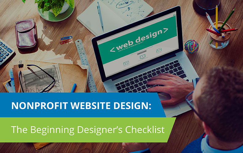
With more and more donors preferring to engage with nonprofits through mobile and digital channels, designing a captivating website for your nonprofit is more important than ever before.
A strong website can help your organization convey its mission, establish trust with your supporters, build stronger relationships with present and potential donors, and ultimately, capture more online donations.
However, in order for your website to reach its full potential, your organization must take a thoughtful approach to design. That means not only designing an attractive and modern-looking website, but also structuring your website in an intuitive way that optimizes online engagement.
In this article, we’ll provide you with a nonprofit web design checklist, chock full of actionable tips to help your organization achieve the most successful web design out there.
Here’s what we’ll cover:
- Decide how to build out your website.
- Feature the primary navigation at the top.
- Keep the navigation simple.
- Make philanthropy apparent.
- Keep branding consistent.
- Put the donation button front and center.
- Offer other engagement opportunities.
- Focus on the donor.
- Ensure it’s mobile-responsive.
- Update your website regularly.
By the time we’re done, your organization should be well equipped to build out a website that will initially capture your donors and keep them engaged for years to come. Now let’s start checking off the list!
[boc_icon size=”normal” icon_position=”left” icon_color=”#0078B7″ has_icon_bg=”” icon_bg=”#ffffff” icon_bg_border=”#ffffff” border_radius=”100%” icon=”icon icon-check-square-o” margin_top=”” margin_bottom=””]
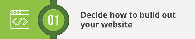
1. Decide how to build out your website.
Before you get started designing your website, your organization will have to determine how to build it out in the first place!
There are a few ways that nonprofits can approach web design.
Using a Website Builder
With a website builder, your organization will be able to design and create a custom website on your own without having to worry about complicated coding. Typically, nonprofits aren’t required to have a lot of CSS or HTML knowledge to use most website builders as you can easily add and move around different elements onto your website.
Choosing the perfect website builder for your organization can be tricky, but it helps to look out for a few essential features. The best site builders will provide a strong balance of easy-to-use tools and customization options. Intuitive templates make it easy to get started, for instance, and then you can further customize these elements to create the exact look and functionality your organization wants.
Designing From a Template
If your organization does decide to use a website builder, you can also purchase pre-built templates, which will give your organization an established webpage structure to work from. With a whole host of templates to choose from for each website builder, your organization will have plenty of options.
As a result, nonprofits looking to create a website quickly, for example, can opt for a template and make small adjustments to make the design and layout their own.
Hiring a Website Designer
If your organization needs a little more support when it comes to web design, consider hiring a designer. Website designers can work with you to create a website that perfectly reflects your organization’s brand and handle all the complicated coding as well.
Alternatively, if your organization already has a website or a tool with website building capabilities, the best solution may be to hire a digital consultant that can help design and customize your website.
These consultants often focus on the “behind the scenes” part of your web design to create an infrastructure that helps organizations raise more money and devise unique fundraising solutions. They’ll also help you guarantee that all of the data you collect on your website through online forms can flow into your donor database or CRM. That way, your site will be both beautiful and functional for managing all of the donors who visit!
Ultimately, there’s no right or wrong way to build your website. Working with a website builder affords your organization more control over the design process and is generally more affordable than working with a consultant. However, enlisting the help of an expert can be a worthwhile investment, especially considering how integral your website is to the success of your nonprofit’s online fundraising.
Just keep in mind that picking a design approach is only the first step. There are a range of website builders, templates, and consulting services out there, so your organization will need to look into different options and evaluate your needs before settling on the perfect solution.
Check this one off the list if: your organization has determined how you’ll approach building your website, whether it be through using a website builder or purchasing the services of a consultant. You should also have selected which specific platform or service you’ll use.
[boc_icon size=”normal” icon_position=”left” icon_color=”#0078B7″ has_icon_bg=”” icon_bg=”#ffffff” icon_bg_border=”#ffffff” border_radius=”100%” icon=”icon icon-check-square-o” margin_top=”” margin_bottom=””]
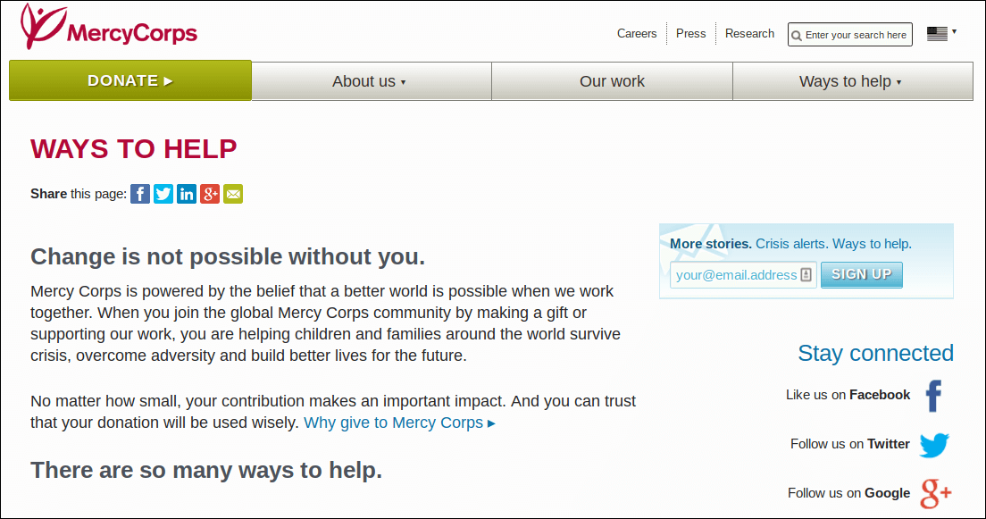
2. Feature the primary navigation at the top.
Now that you have the tools, it’s time to get down to design!
One of the most important elements of any website is the navigation. The primary navigation:
- Helps determine the overarching structure of your organization’s website.
- Subtly highlights the most important pages for donors.
- Enables users to get to the pages they’re looking for quickly and without any hassle.
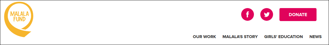
In other words, navigation is key to how your users will experience your website. To provide your donors with the most intuitive experience, the main navigation bar should be at the very top of the page (like on this page!).
By featuring the navigation in such a prominent place, it will be readily accessible to users on all pages of your website. If a supporter lands on your site with a specific page in mind, they can simply click the link they want and land on it without having to search for a needle in a haystack.
Such an easy and intuitive browsing experience will naturally result in supporters engaging with your website for much longer!
Check this one off the list if: you have featured the primary navigation bar at the very top of all of your webpages.
[boc_icon size=”normal” icon_position=”left” icon_color=”#0078B7″ has_icon_bg=”” icon_bg=”#ffffff” icon_bg_border=”#ffffff” border_radius=”100%” icon=”icon icon-check-square-o” margin_top=”” margin_bottom=””]
3. Keep the navigation simple.
Making sure that users can access your navigation is an excellent first step, but they won’t be able to get anywhere if your navigation is cluttered or confusing. Simplicity is key!
Keeping the navigation simple encompasses:
- Minimizing the number of pages. The primary navigation (the main bar at the top of your site) shouldn’t be jam-packed with information. It should feature only the most important pages (for example, “About Us,” “Events,” the link to your donation button, and any other page that’s key to how your organization engages donors) so that users know what’s most important and aren’t overwhelmed by choices.
- Using the right language. The language featured on your navigation should be simple, concise, and clear. Visitors should know instantly where each link leads. Try to keep all navigation titles to only one or two words and avoid any technical language or jargon to ensure donors can understand where the navigation is leading them.
- Optimizing drop down menus. If your organization has more important pages to feature than can fit in your top navigation bar, you can use drop down menus to direct visitors to secondary pages. But just as with the main navigation bar, drop down menus should be minimalistic. Keep them to one level and make sure titles are short and clear.
Designing your navigation with simplicity in mind is another easy way that you can keep supporters interacting with your site for longer!
Check this one off the list if: your organization has determined an overall navigation structure and has kept your navigation menu simple by paring down which pages to include, using language that’s easy to understand, and thinking strategically about drop down menus.

[boc_icon size=”normal” icon_position=”left” icon_color=”#0078B7″ has_icon_bg=”” icon_bg=”#ffffff” icon_bg_border=”#ffffff” border_radius=”100%” icon=”icon icon-check-square-o” margin_top=”” margin_bottom=””]
4. Make philanthropy apparent.
Your website is the hub of your nonprofit’s online presence, and it should convey what your organization is about from the moment a visitor lands on your homepage. That means not only making it clear that supporters have landed on a nonprofit website, but also showing them what exactly philanthropy means to your organization.
In other words, when designing your homepage, make your cause and work the centerpiece!
Here’s how it’s done:
- Include stirring photos. Since it ties into what people are passionate about, nonprofit work can be incredibly emotionally charged. It often takes an emotional appeal to convert supporters to your cause and mobilize them into action. Including compelling photos of the work you do and those you serve can give your website a personal touch, all while conveying your message in an immediate and impactful way.
- Feature your mission. Above the fold (the part of the webpage that’s visible without a user having to scroll), include a condensed version of your mission statement. Users can scan your elevator pitch and learn what’s most important to your organization in a matter of seconds!
- Highlight other engagement opportunities. To increase website conversion (donations received or other actions taken), provide users with a couple of opportunities to keep interacting with you above the fold on your homepage. For example, you could include an “About Us” button for prospective supporters who are just looking to learn more about your organization and a “Donate Now” button for those supporters who have sought out your website to take the next step in supporting you.
When your website is centered around what’s essential—your cause, your mission, and your work—it’s sure to be the perfect reflection of your nonprofit.
Check this one off the list if: a first-time visitor has landed on your website and can give you an (accurate) summary of your organization’s cause and mission just by looking at your homepage.

[boc_icon size=”normal” icon_position=”left” icon_color=”#0078B7″ has_icon_bg=”” icon_bg=”#ffffff” icon_bg_border=”#ffffff” border_radius=”100%” icon=”icon icon-check-square-o” margin_top=”” margin_bottom=””]
5. Keep branding consistent.
We’ve already touched on the fact that your website should be all about your organization. Designing around your cause and mission is one way to make sure that you’re designing a website that’s unique to you, but an even more straightforward way is to design with consistent branding.
Maintaining consistency and keeping your branding airtight helps build trust, since supporters can be sure they’re interacting with your nonprofit, wherever they might land.
Building trust is especially important if you’re accepting online donations, as donors are far less likely to complete the donation process if they’re dubious about the legitimacy of your site in any way.
Here are a few tips to keep in mind when it comes to branding:
- Feature your logo in the top lefthand corner. Most donors will expect to see your organization’s logo placed in the top left corner, as it’s now a design standard. Including your logo here ensures that it’s visible on all pages, serving as a subtle reminder that donors are engaging with your brand.
- Decide on a color scheme. Choose a color scheme that matches your logo before you start designing. You should have 2-3 main colors (brights), as well as a couple of neutrals that you can design around. Make sure to set guidelines for where each color is used (for example, what color will hyperlinks be?) and to set each guideline as the default in your theme if you’re using a website builder.
- Select a font. Decide on one font to use across the board on your website. While your font should reflect your organization’s personality, keep in mind that large, sans serif fonts are the easiest to read on screens.
- Brand webforms. Nonprofits often build out their online donation forms and other webforms using third-party software, so it can be easy to forget to brand your forms. However, establishing trust is most crucial during the donation process itself, so don’t forget this step!
Once you’ve decided on some guidelines, it can be helpful to put together a style guide that your staff can consult when making changes to your website. That way, it will be much easier to maintain consistency.
Check this one off the list if: your organization has put together a completed style guide that outlines all website branding requirements.
[boc_icon size=”normal” icon_position=”left” icon_color=”#0078B7″ has_icon_bg=”” icon_bg=”#ffffff” icon_bg_border=”#ffffff” border_radius=”100%” icon=”icon icon-check-square-o” margin_top=”” margin_bottom=””]
6. Put the donation button front and center.
Chances are, one of the biggest goals your organization wants to achieve through its website is securing more online donations.
Many (if not all!) of the tips discussed here can help you see higher conversion rates. However, there’s one very simple and obvious way to score more online donations: putting your donation button front and center.
Place your donation button in your top navigation bar and feature it in a bold color that stands out from the rest of your site. You should also include your button in other (natural) spots, like on your homepage and “Ways to Give” page.
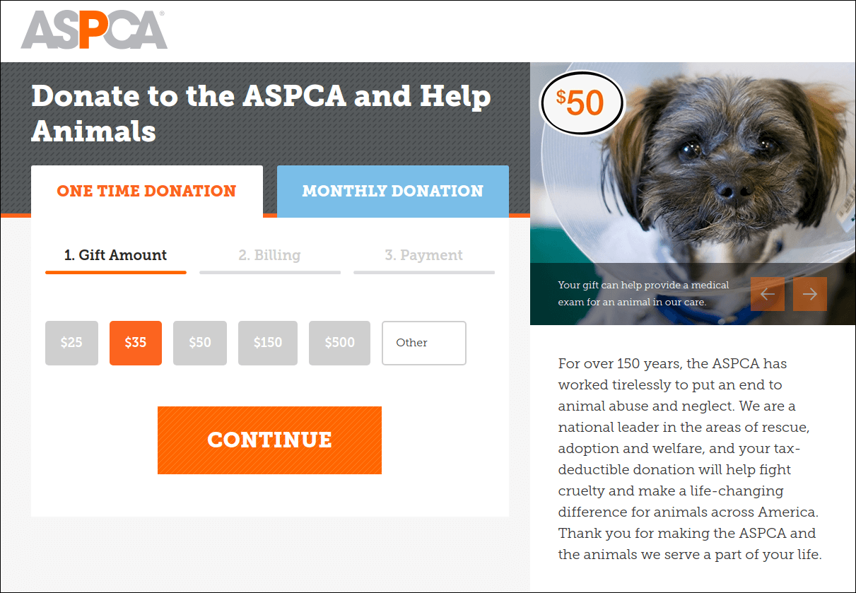
When it comes to fundraising, it’s crucial to strike while the iron is hot. Putting your donation button in your main navigation ensures that, no matter which page they visit, your supporters will be able to access your donation form the minute the urge to give hits.
If your donation page is difficult to find even in the slightest, it greatly reduces the chances that a donor will land on your form, nevertheless see the donation process through to the end.
Check this one off your list if: your donation button has been built into your top navigation and incorporated into other organic spots on your website.
[boc_icon size=”normal” icon_position=”left” icon_color=”#0078B7″ has_icon_bg=”” icon_bg=”#ffffff” icon_bg_border=”#ffffff” border_radius=”100%” icon=”icon icon-check-square-o” margin_top=”” margin_bottom=””]
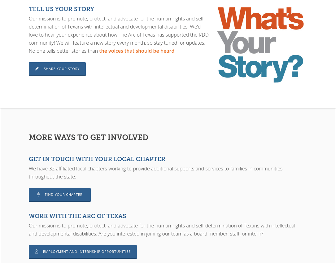
7. Offer other engagement opportunities.
Making a gift may be the pinnacle of donor engagement, but that doesn’t mean it’s the only high point!
Supporters at all stages will be visiting your website, from those who have just recently heard about your nonprofit and are interested in learning more to the most loyal supporters who are seeking updates and looking to become more invested in your organization.
Point is, some visitors won’t be ready to donate, but that doesn’t mean that they aren’t interested in supporting your nonprofit in other ways. By providing multiple engagement opportunities, you can meet supporters at various stages of engagement and begin (or continue!) building deeper relationships with them.
The engagement opportunities you’re able to provide depend on how your nonprofit connects with supporters, but here are a few ideas:
- Signing up for an email newsletter.
- Following your nonprofit’s social media pages.
- Volunteering.
- Attending an event.
- Participating in a peer-to-peer or crowdfunding campaign.
- Joining your membership program.
You can feature these opportunities around your site (for example, information about volunteer activities might be on a dedicated volunteer page, while a subscription box located in the bottom corner on all of your pages might prompt supporters to sign up for your email newsletters).
Just remember that opportunities should be actionable. Users should know exactly what actions your nonprofit is encouraging and how to follow up on any opportunity that interests them.
Check this one off your list if: your organization has devised a range of engagement opportunities you can offer supporters and has clearly incorporated them into your website.

[boc_icon size=”normal” icon_position=”left” icon_color=”#0078B7″ has_icon_bg=”” icon_bg=”#ffffff” icon_bg_border=”#ffffff” border_radius=”100%” icon=”icon icon-check-square-o” margin_top=”” margin_bottom=””]
8. Focus on the donor.
Your website may be all about your nonprofit, but don’t forget about who’s behind it all: your donors! They’re the ones that are keeping your organization’s doors open and enabling you to enact the good work that you do.
When designing your website, it’s of the utmost importance to keep the donor in mind.
While it may sound harsh, potential donors aren’t visiting your site to learn about your organization. They’re visiting your site because they want to learn about what your organization can offer them and how they can get involved to benefit the causes they care about most.
Here’s how you can ensure your website is donor-centric:
- Watch your tone. When writing website content, imagine that you’re speaking face-to-face with your donors. Use respectful but conversational language, and address your audience with second person pronouns. Uses of “you” should significantly outnumber uses of “I” or “we.”
- Make donors the protagonists of your stories. Whenever your organization is giving an update or sharing a story, focus not on your own accomplishments, but on the contributions that donors made and how these contributions made your accomplishments possible.
- Use your website to say thanks. Consider featuring a “Donor of the Week” or “Donor of the Month” to show donors who have gone above and beyond a little extra appreciation. Featuring real donor stories will also help other prospective supporters better envision the impact their involvement could make.
Your website was built for your organization but meant for your donors. Make sure to illustrate their impact and show them your appreciation!
Check this one off your list if: the number of second person pronouns on your site outnumber the first person pronouns, your content features your donors’ roles in your organization’s story, and supporters will leave your website feeling that their contributions matter.

[boc_icon size=”normal” icon_position=”left” icon_color=”#0078B7″ has_icon_bg=”” icon_bg=”#ffffff” icon_bg_border=”#ffffff” border_radius=”100%” icon=”icon icon-check-square-o” margin_top=”” margin_bottom=””]
9. Ensure it’s mobile-responsive.
To refresh, a website that is mobile-responsive looks and functions just as well on a smartphone or tablet as it would on a laptop or desktop. It fits into the confines of any device so that the user will never have to manipulate their screen to read a sentence or take an action.
Users are far less likely to interact with content that inconveniences them in any way (hence the 126% decrease in donations seen in nonprofit websites that aren’t mobile-responsive), so it’s crucial that your organization designs a website that’s just as much meant for mobile as it is for a computer.
Most website builders should automatically generate a mobile version of your site for you, but it still can’t hurt to follow these mobile web design best practices:
- Design in a vertical, one-column layout.
- Use large, sans serif fonts.
- Enlarge buttons.
- Avoid using too many elements.
Ultimately, optimizing your website for mobile will provide users with a positive experience and maximize the number of online donations you receive, both of which will give your fundraising a boost!
Check this one off the list if: you’ve pulled out your smartphone or tablet and can view and navigate your website without having to pinch, scroll, zoom, or otherwise adjust your screen.
[boc_icon size=”normal” icon_position=”left” icon_color=”#0078B7″ has_icon_bg=”” icon_bg=”#ffffff” icon_bg_border=”#ffffff” border_radius=”100%” icon=”icon icon-check-square-o” margin_top=”” margin_bottom=””]
10. Update your website regularly.
If you’ve initially designed your website in accordance with these best practices, your organization is off to a great start!
However, you can’t just step away from your website forever and hope that your donors will continue to be engaged and that their donations will continue to flood in.
Web design trends change, and in order to stay current, your organization will have to update your website regularly.
You should be making minor updates at least monthly (for example, posting new articles to your blog or adding new events to your calendar), but you should also set aside a time to make major updates about every three years.
Updating your website on a regular basis ensures that it always looks modern and reflects your organization’s brand and current work. This is important for a few reasons:
- It establishes trust. Contemporary websites look more credible and are far more likely to be trusted by donors. And, as we touched on earlier, establishing trust is essential to scoring donations.
- It shows donors that you’re interested in engaging with them. If your organization doesn’t update your website, your supporters might take it to mean that you’re not interested in engaging with them, or even worse, that you’re no longer active. By making changes and posting new content, you reassure donors that their relationships with your organization are worth spending time on.
- It allows you to keep improving. It’s more than likely that your website won’t be perfect from the get go. Setting aside time to make updates ensures that you can correct any elements that might not be working to make your website even more engaging.
Making updates will keep your website looking and feeling fresh. Set aside time every few years to make adjustments!
Check this one off of the list if: your organization has set a future date for making the first round of updates to your website.
If you’ve checked these ten tips off of your list, your organization is well on its way to web design success!
For more information on website design, check out these additional resources:
- Shocking Reasons Why Passwords Won’t Protect Your Website. Websites often use passwords to protect a website’s sensitive information, but this type of credential can be easily compromised. Learn about 6 reasons why passwords won’t cut it for your security.
- 7 Ways To Create A Modern Password & Username Login Process. In addition to your website’s design, you should also focus on the user-experience of your login process. Get expert tips on how to make your login secure and donor-friendly.
- Understanding the Fundamentals of Website Authentication. Website authentication is the process in which donors are verified to gain access to their accounts. Learn the in’s and outs of implementing a secure authentication method.