
In an increasingly digital world, it’s essential for nonprofits to establish their presence online.
Having a well-designed website allows visitors to learn about your mission and get involved. It’s also an opportunity to share important resources, engage with potential supporters, and make online giving easy.
In this guide, we’ll provide you with our favorite examples of effective nonprofit websites as well as tips so you can make the most of yours:
Whether you’re refreshing your site or starting from scratch, these best nonprofit websites are guaranteed to inspire!

15 Best Nonprofit Websites
1. Save the Children Action Network
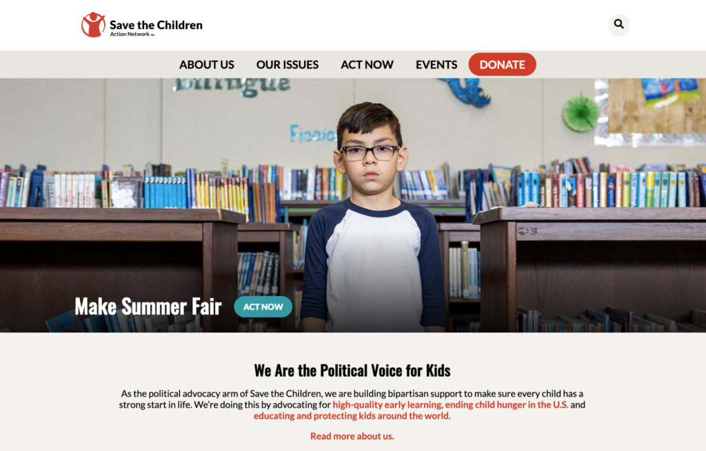
Nonprofit Website Overview
Save the Children Action Network (SCAN) is the political advocacy branch of Save the Children. Their mission is to build bipartisan support for the health, safety, and education of every child in the United States. With the happiness and well-being of children on the line, SCAN needed a robust site that could be used for their important outreach efforts.
That’s where Cornershop Creative came into play. The web design agency helped to create a clean, modern site that is easy to navigate and mobile optimized so users can access it on any device.
Why This Site Stands Out
This website stands out for its ability to provide an engaging experience for visitors. We especially love the multimedia design elements on their homepage. From the interactive map to the clear calls to action, this nonprofit site is designed with functionality in mind.
Another notable feature is the site’s integration with the Salsa platform, which allows SCAN to collect email sign-ups, create petitions, and gather RSVPs all in one place. This integration not only simplifies data management, but supporters are also more likely to get involved when engagement opportunities and virtual fundraising resources are incorporated directly into the site.
2. MAHUBE-OTWA
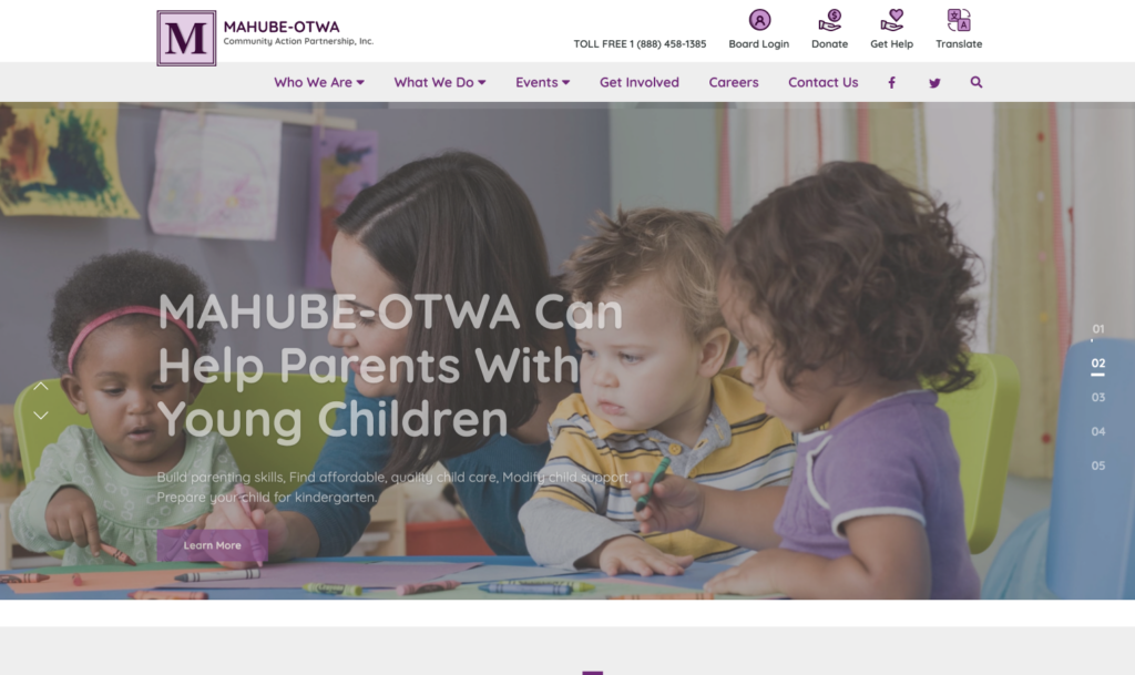
Nonprofit Website Overview
MAHUBE-OTWA is a nonprofit communication action agency which uses programs to raise concern and commitment towards combating poverty. Their programs are wide-ranging and include exercise classes for senior citizens, child care for parents, mental health counseling, and housing assistance.
With so many programs to keep track of and promote, it’s important that their website is clear and organized. Thankfully, Morweb, a CMS platform, was able to take charge and prioritize clarity throughout their site.
Why This Site Stands Out
As an organization, MAHUBE has their hands on multiple projects that aid impoverished communities. Their comprehensive operations are mirrored in this unique website. It provides everything visitors need to get involved, but in a simple, easily digestible format!
Rather than overwhelming visitors with a long list of program information, the homepage features five simple buttons that link to separate program pages. Between this well-organized landing page and clear site navigation, MAHUBE made their complex organization simple and easy to understand.
3. North York Women’s Shelter
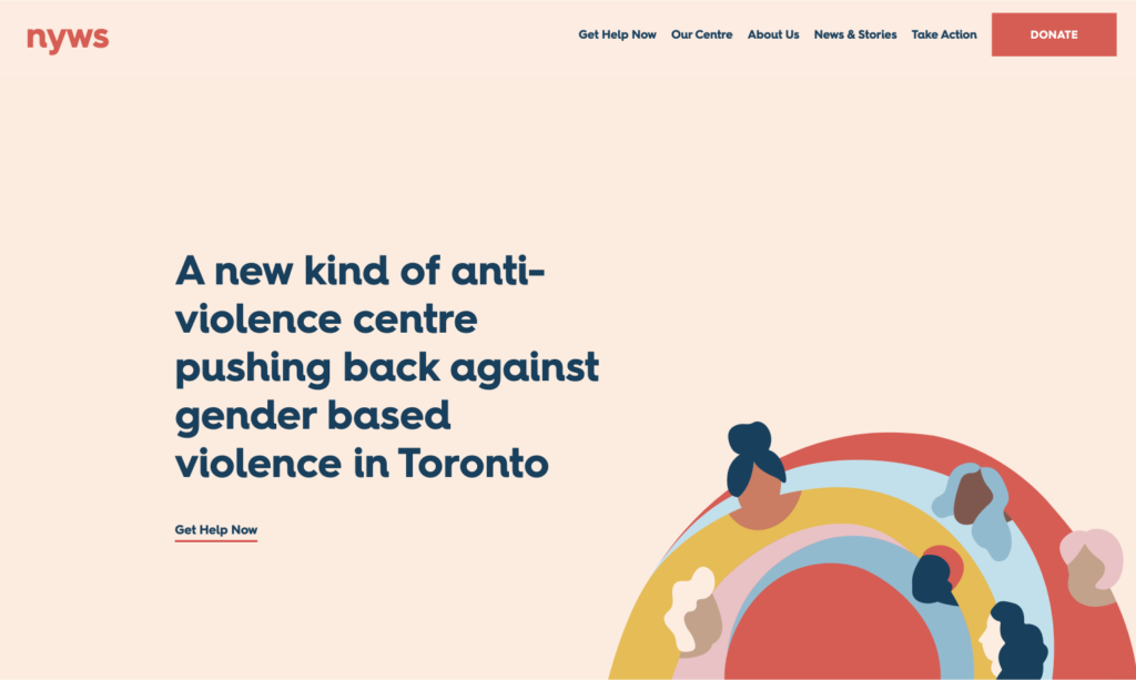
Nonprofit Website Overview
North York Women’s Shelter (NYWS) is an anti-violence center committed to ending gender-based violence in Toronto. This nonprofit provides comprehensive services and a 17-bedroom emergency shelter to women and children in need.
NYWS is constantly evolving to meet the needs of their community and recently found itself in need of a new website to reflect this evolution. Loop, a full-service creative agency, helped to capture the essence of their brand with a strong, energetic web design.
Why This Site Stands Out
NYWS’s website is a safe space for women. The design is free of clutter and has clear pathways to helpful resources so as not to overwhelm users who are already in distress. Diversity and strength are also reflected in the graphics and photos featured throughout the site.
Graphic design is a thoughtful part of the NYWS brand as their work is sensitive and many victims of violence don’t feel comfortable being photographed. The graphics convey a sense of optimism without taking away from the seriousness of their work.
4. Malala Fund
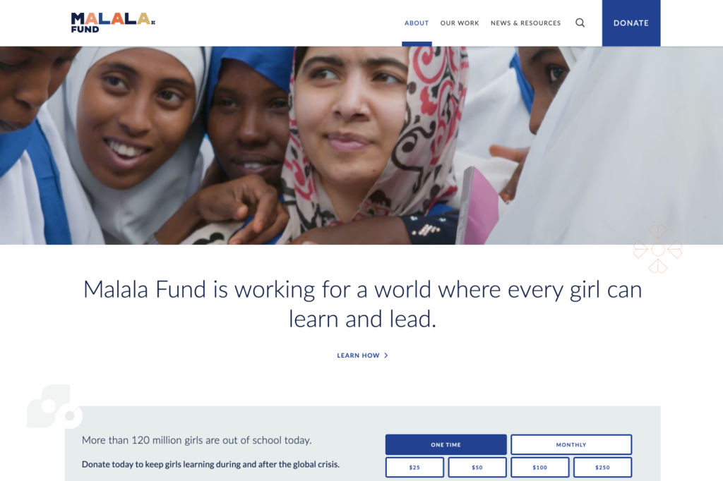
Nonprofit Website Overview
The Malala Fund is an international nonprofit that advocates for policy changes to support the education of girls around the world. Inspired by Malala Yousafzai, a young Pakistani activist, the Malala Fund works in regions where many young women don’t have access to secondary education.
In 2019, the organization underwent a major brand refresh, which brought the Malala site to life. Their website is now more vibrant and beautifully exemplifies their mission.
Why This Site Stands Out
The Malala Fund site includes the colors, patterns, and shapes found in traditional fabrics from various world cultures. It feels youthful, uplifting, and authentic, which is exactly what Malala stands for.
Additionally , the site’s content is rich in stories of hope and perseverance. Visitors can learn about the importance of women’s education, explore the organization’s advocacy work, and even download fact sheets. These resources are made immersive through photo, video, and graphic design.

Take a Personalized Tour
Schedule a demo with one of our fundraising consultants. We’ll show you how the Snowball platform has benefited other nonprofit organizations, and how it can help you.
5. WWF Canada
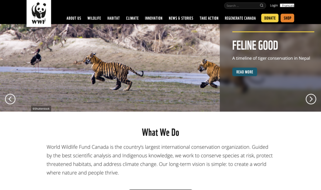
Nonprofit Website Overview
WWF Canada is a leading organization for global conservation work with the ultimate goal of protecting wildlife and their habitats. From advocating for endangered species to implementing conservation solutions, the WWF team works locally and globally to save the planet.
Loop collaborated with WWF Canada to create the Living Planet Technology Hub section of their website. This digital platform showcases how WWF uses cutting-edge conservation technologies.
Why This Site Stands Out
WWF Canada’s site is truly one-of-a-kind. It blends the natural and digital worlds by combining immersive wildlife photography with tech elements like custom icons, animations, and image overlays.
Visitors can scroll through a carousel of WWF’s conservation technologies and click on the ones they want more information about. Whether they choose remote sensing technology or camera traps, the site provides clear explanations that make exploring these technologies simple and straightforward. This structure keeps users on the site for longer, which increases the chances of engagement and action.
6. Red Panda Network
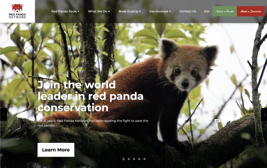
Nonprofit Website Overview
The Red Panda Network, located in Nepal, is committed to the conservation of wild red pandas and their habitat. When you explore their site, there’s no doubt that this nonprofit is a world leader in protecting wildlife.
Created by Morweb, beautiful wilderness shots and a natural color scheme draw viewers into the heart of Red Panda network’s purpose.
Why This Site Stands Out
The Red Panda Network site has a clear goal: to inspire users to join their cause. Visitors are meant to feel inspired from the moment they land on the homepage. It takes them on a journey through the entire organization, defining their mission, purpose, impact, and campaigns through compelling design elements.
Visuals are key here. From the pictures of fluffy pandas to the running tally of forests preserved, their homepage tells a story and sparks emotion. It’s no wonder, then, that this website receives so much attention.
7. Avodah
Nonprofit Website Overview
Avodah is committed to providing Jewish leaders with the tools and experience needed to create change. The nonprofit prides itself on diversity, inclusion, and community engagement.
Their site, designed by Cornershop Creative, is a direct reflection of the Avodah brand. It’s a welcoming space where individuals can find information about programs, see the impact made by the organization, and offer their own support.
Why This Site Stands Out
The Avodah site fosters engagement and supports user experience. It’s bold, beautiful, and easy to use on a mobile device, which is crucial for their young target audience. We especially love the “Who We Are” page, which features a clear mission statement and graphics to represent their locations across the United States.
The site also has a MailChimp add-on that passes data from the email sign-up forms directly into their database. Avodah sends out branded emails and receives meaningful metrics in return—a win-win situation!
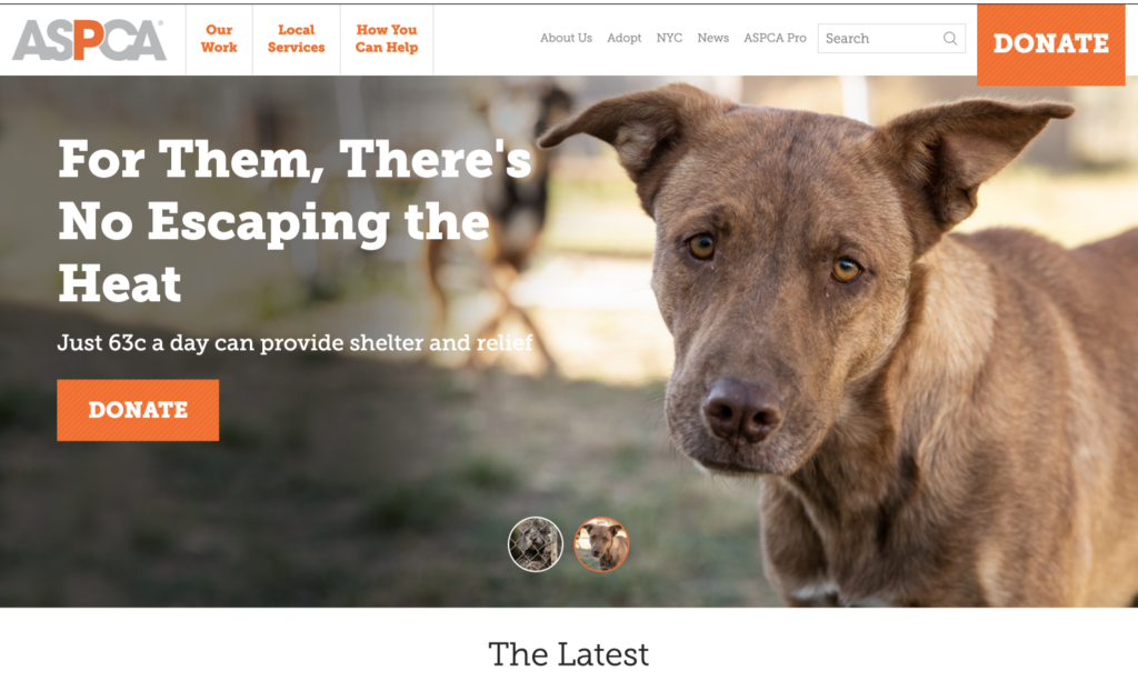
8. ASPCA
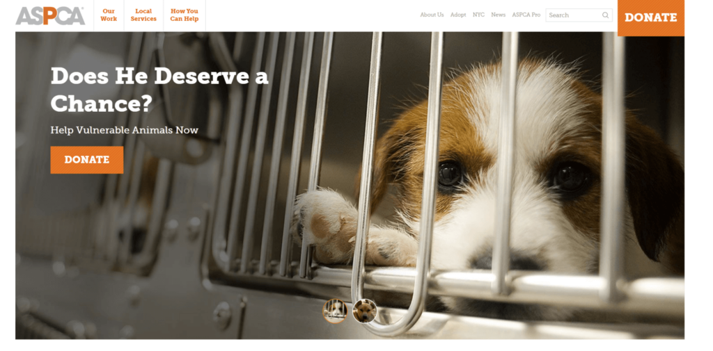
Nonprofit Website Overview
The American Society for the Prevention of Cruelty to Animals (ASPCA) was the first humane society in North America and is now one of the largest in the world. The organization is dedicated to rescuing animals from abuse.
ASPCA believes every animal deserves respect and kindness at the hands of humans. An online presence is the key to spreading their mission.
Why This Site Stands Out
Humane societies like the ASPCA understand that having an animal-centric website design is essential for gaining support. Images of puppy-eyed animals tug at your heartstrings, making their mission impossible to ignore.
The site also includes strategic calls to action (CTAs) that invite visitors to lend a helping hand. These CTAs appear on nearly every landing page and take the form of headlines, buttons, and featured images. A“Donate Today” button not only speaks directly to the audience but also creates a sense of urgency that encourages visitors to show their support.
9. Penny Appeal USA
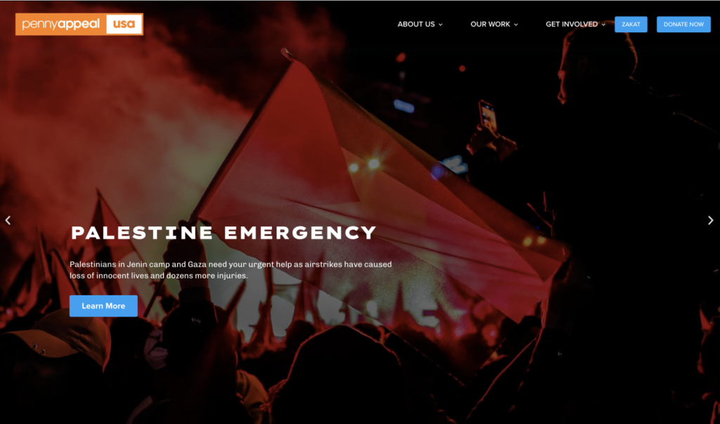
Nonprofit Website Overview
Penny Appeal USA is a relief and development organization that works to eradicate poverty around the world. The nonprofit previously operated on two separate platforms, one for their blog and another for their main website, which made it difficult to gain steady traffic and donations.
That was, until they came across Cornershop Creative’s content migration service. After merging the two sites and making the design more cohesive, Penny Appeal USA had a fresh new website that they could easily manage and update.
Why This Site Stands Out
The Penny Appeal USA site made our list because of its attention to visual design. The bright colors, compelling imagery, and immersive digital elements engage users and encourage them to take action!
If you’re looking for interactive design inspiration, look no further than their custom donation page, which allows donors to scroll through a wide variety of campaigns and appeals. There’s also a timeline that displays program phases and a multi-step volunteer form that seamlessly integrates with data from their Salesforce database.
10. Special Olympics
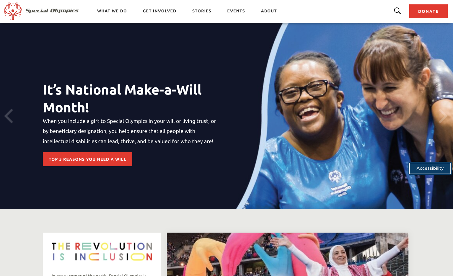
Nonprofit Website Overview
Special Olympics is the world’s largest sports organization for people with intellectual and physical disabilities, providing year-round training and activities for participants across the globe.
Special Olympics has several audiences that interact with their organization, including volunteers, donors, athletes, sponsors, and the general public. Their website was designed and developed to allow these website visitors to quickly find information and lend their support.
Why This Site Stands Out
The Special Olympics site is vibrant and user-friendly. With an organized menu structure, users can easily navigate to key pages and access important information.
The Special Olympics has a goal to promote inclusivity both on and off the field. This is made apparent through their site. They offer an accessibility toolkit including a screen reader, dictionary, font editor, and more features to help every visitor get the most out of the website.
Take a Personalized Tour
Schedule a demo with one of our fundraising consultants. We’ll show you how the Snowball platform has benefited other nonprofit organizations, and how it can help you.
11. Nonviolent Peaceforce
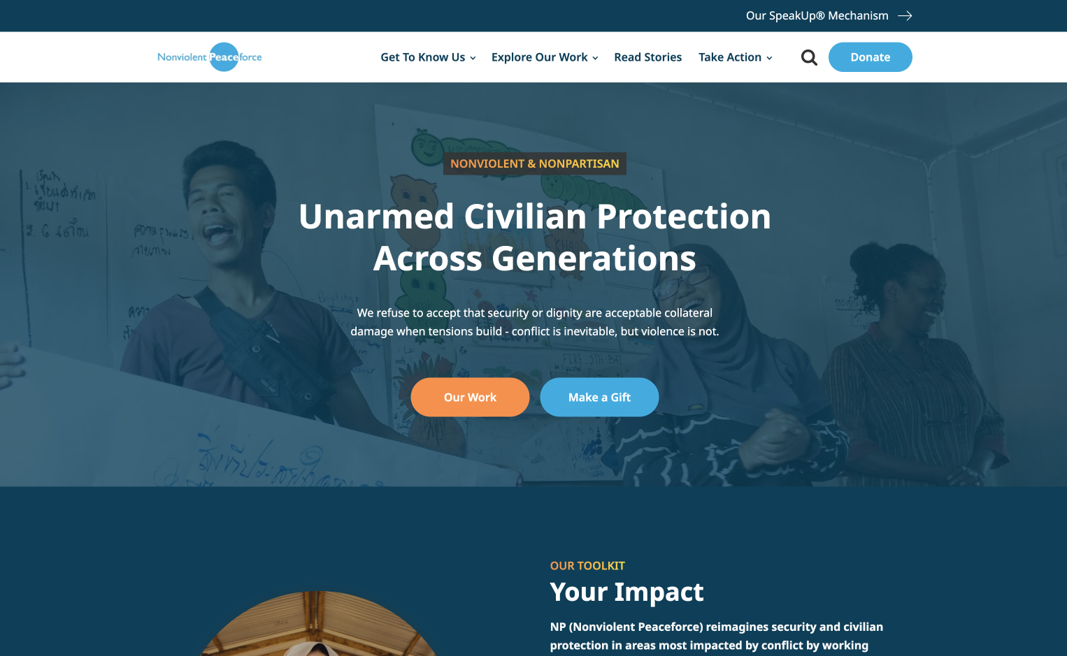
Nonprofit Website Overview
The Nonviolent Peaceforce is dedicated to protecting civilians and reducing violence in areas affected by armed conflict. Before meeting the designers at Cornershop Creative, the nonprofit was running on an outdated site that was difficult to update and manage.
The design agency breathed new life into the site, ensuring it had a global online presence that matched the nonprofit’s wide reach.
Why This Site Stands Out
Nonviolent Peaceforce’s website is focused on the people they serve and the supporters that further their cause. When you land on the homepage, you’re immediately drawn into compelling images of real people affected by armed conflict. As you keep scrolling, you’ll notice meaningful graphics, like a butterfly to represent the transformation of communities.
Another notable feature of this website is that it’s accessible in any language. The entire website, including the donation pages and volunteer forms, can be translated to meet the language preferences of every user. Plus, the metadata is automatically translated so that the website appears in search results all over the world.
12. JUST of DuPage County Correctional Facility
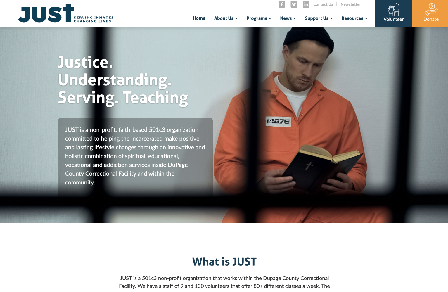
Nonprofit Website Overview
JUST is a faith-based nonprofit committed to helping incarcerated individuals make positive and lasting lifestyle changes through spiritual, educational, vocational, and addiction services.
Designed by Morweb, the website strips JUST’s brand down to its essence so potential supporters can engage with their cause without anything in their way.
Why This Site Stands Out
JUST stands out for its clean, minimalist site design. Minimalism is all about simplifying your website and removing any unnecessary elements that clutter the page or distract viewers. It provides clarity and lends itself to seamless navigation.
Their “Programs Overview” page is an example of minimalism at its best. The web designer clearly wasn’t afraid of white space here. All of the sections are neatly organized and the negative space balances out the other elements, making it seem like everything has a proper place!
13. Double Up Food Bucks
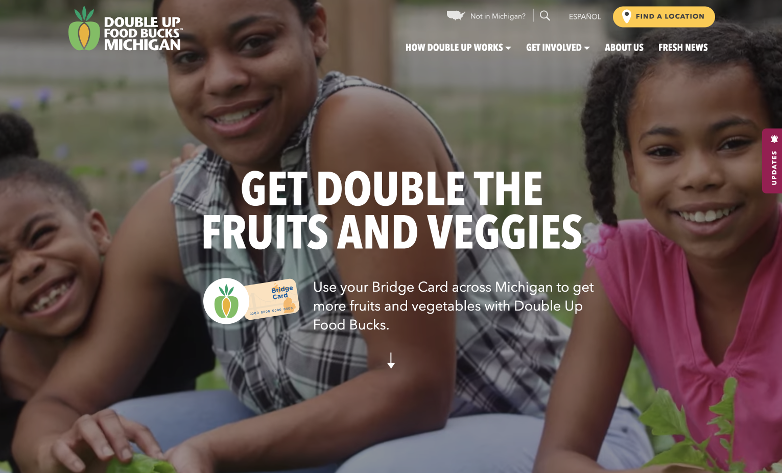
Nonprofit Website Overview
Double Up Food Bucks addresses food insecurity in the state of Michigan by matching fruit and vegetable purchases dollar for dollar. Double Up improves access to fresh food and supports local agriculture and farmers’ markets, making it mutually beneficial for everyone involved!
The Loop team has worked closely with Double Up to create an intuitive and empowering digital platform for the program.
Why This Site Stands Out
Double Up’s website breaks the stigma around food assistance and helps people connect with important resources. Through the use of colorful graphics, animated videos, photography, and testimonials, the website becomes an extension of the Double Up brand. People can immerse themselves in the cause and feel proud to be a part of it.
Plus, the website can be translated into Spanish, allowing more users to access and appreciate the content. It also integrates with the Salesforce platform, so the Double Up staff can manage a participating locations map and capture valuable data.
14. Metropolitan Museum of Art
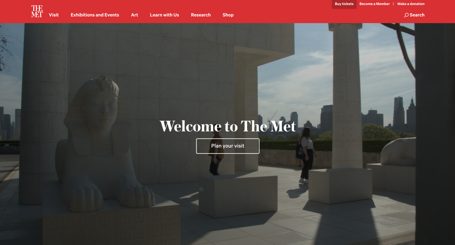
Nonprofit Website Overview
The Metropolitan Museum of Art (MET) is one of the most famous museums in the world. It houses over 60 exhibitions each year and hosts around 6.7 million in-person visitors and 33 million website visitors.
Such a renowned art museum needs an artistic website to match. Vivid imagery is the MET’s speciality and that shines through on their site.
Why This Site Stands Out
The MET website is powered by art and design. Vivid photography and contrasting colors hold your attention as you scroll through the various art exhibits, collections, and publications.
The website offers a glimpse into the creative and inspiring world of archives. Their homepage, in particular, pays close attention to formatting and organization in order to keep visitors engaged. The hero scene shows footage from inside the museum and features a bold headline and descriptive CTA, boosting curiosity and encouraging visitors to explore the collection.
15. Oxfam Canada
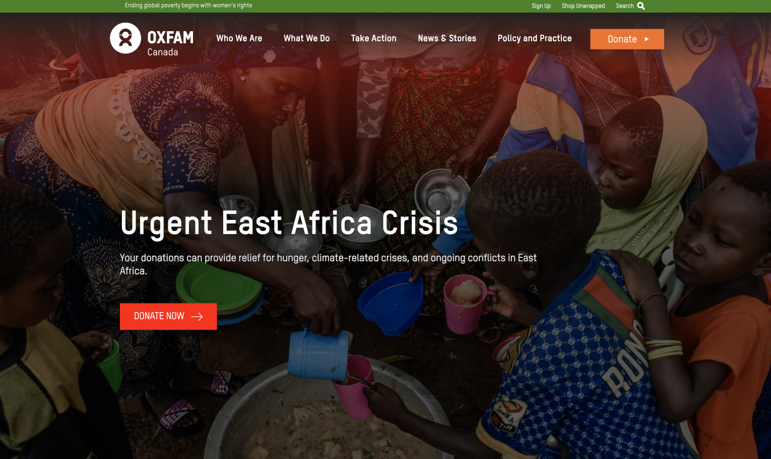
Nonprofit Website Overview
Oxfam Canada is part of a global movement to end poverty and inequality with a focus on women’s rights. From advocating for women’s leadership to assisting in global refugee crises, this organization is making an impact around the world.
Loop collaborated with Oxfam Canada to enhance their website so that it directly elevates the movement and engages younger audiences that are passionate about gender equality.
Why This Site Stands Out
The core message of Oxfam Canada’s website is that ending poverty begins with women’s rights, which is made clear through vibrant visual storytelling. Visitors are able to connect to the stories of real women and girls through video and photography. Emergency appeals and campaigns are further brought to life with immersive graphic design and direct calls to action.
The website also integrates with donor and campaign management software, creating a seamless experience for visitors wanting to take action.
Tips for Creating Your Own Nonprofit Website
As you plan out your own nonprofit website,keep these tips in mind:
- Define your target audience. When you decide who exactly you’re trying to reach with your site, you can speak to them directly. That way, your supporters will feel more connected to your organization and more likely to take action.
- Pay attention to the principles of design. All great nonprofit websites use typography, design, color, and visual hierarchy to effectively convey their message.
- Use clear calls to action. Ensure donors can easily lend their support by featuring calls to action in prominent places, such as your main navigation bar.
- Promote accessibility. Your nonprofit’s website should be accessible to everyone, including users with permanent or temporary visual, auditory, motor, and cognitive disabilities. Use high contrast, closed captions, and alt text to make your website inclusive.
- Optimize for mobile. Make sure your website loads properly on the small screens of phones and tablets by keeping layouts vertical and using larger fonts and buttons.
- Integrate your website with other tools. Software like Snowball can turn your website into an all-in-one fundraising platform, with tools like website buttons, widgets, short links, auction pages, and payment processing.
Building an online presence can seem overwhelming, but the increased recognition and traffic will make the extra effort worthwhile in the long run.
Additional Nonprofit Website Resources
Nonprofit websites tend to require a lot of effort during the planning process—especially if it’s your first one. But, between the online donations and the increased engagement, the ROI can be incredible!
Check out these additional resources to learn more about how Snowball can support your nonprofit’s website:
- Nonprofit Web Design: 5 Key Elements to Elevate Your Site. Your nonprofit’s website is vital for educating visitors and facilitating online donations. Elevate your site to the next level by optimizing five things.
- Best Nonprofit Software to Raise Money Fast. Ready to build a digital toolkit that really works? Check out our picks for the best nonprofit software to get your organization up and running online fast.
- Virtual Auctions: How to Plan A Fruitful Event in 5 Steps. Now that you have an impressive website, consider hosting a virtual action to bring your favorite charity event digital.
Do you want to take your nonprofit's online presence to the next level?
Explore Snowball’s comprehensive features with a free demo.